
In the Organization Management (Admin) application, we have added a new tab called “Report.” In this tab, users can access visual representations of statistics pertaining to the Organization Management application.

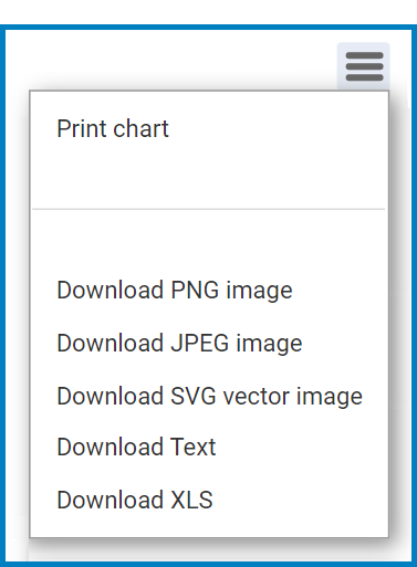
- Chart Context Menus: These are hamburger buttons which, when collapsed, display a list of options that allow users to either print or download the corresponding chart.
- Icon:
![]()
- If selected, it will display the following menu:
![]()
- Icon:
- Count: This is quantitative data that users can access by hovering their cursor over the different symbols in the charts. (Symbols, in this case, refers to the slices of the pie charts.)
![]()

Laissez votre avis sur ce sujet.