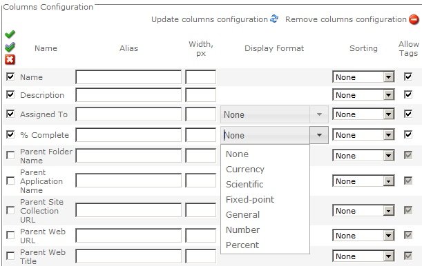
Use the Columns Configuration section on the Configure Display Provider step to select columns that should be displayed by the Lightning Conductor Web Part decide when data to display and how that data should be formatted.
There are four links at the top right of the section that allows you to:
- Update the Lightning Conductor Web Part with the columns selected.
- Remove all column configurations.
- Add calculated column (new in version 5.1)
- Configure Advanced filtering.
Below these links you can configure column selection, and additional selection criteria, such as sort priority and grouping name=“col”>
Column Selection
Use the grid representation of check boxes, drop down list and icons to select the columns that should be displayed, the items to be displayed and how the items should be formatted.
- Columns to be displayed: Select the check box to the left of the column name to choose which columns will be displayed. The three icons above the left checkboxes allow you to select all columns
, invert the selection
, and uncheck all columns
.
- Column alias: Type in the Alias text box an alternate name for the column title.
- Column width: Type in the Width, px text box the width of the column in pixels.
- Number format: Select from the Display Format drop down list the format of numerical columns, for example, Date/Time, Number columns. You can also type a custom date format, of the same format as you use when using the XSL view.
- Sorting: Use the Sorting drop down list to sort the items displayed using that column in ascending or descending order. To improve the performance of a lists or libraries, that contain a large number of items, you can create indexes on the columns you will be sorting on.
- Allow Tags: Use this check box when for Rich Text column types. If the column contains HTML you can show or hide the HTML tags.
- Ordering: You can set the order of that the columns will appear in the Web Part, by using the Top
, Bottom
, Up
and Down
blue arrows.
- Filtering. You can filter the number of items return based on values in one column, by using the Filtering icon
, or more columns by clicking the Advanced filtering link in the top right of the Columns Configuration section. Click the Remove All Filters icon
, to remove all persistent filters from all columns.
- Conditional Formatting. Click the formatting icon
to display the Configure Conditional Formatting dialog, which you can use to apply formatting to the items in the Lightning Conductor Web Part. Click the Remove All Formatting icon
, to remove all filters from all columns.
- Summary: Click the Summary icon
to summarize the data from the data source, such as, displaying the total number of issues or the total monthly salary paid to employees. Click the Remove All Summaries icon
, to remove all summaries from all columns.
Additional selection criteria
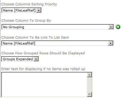
At the bottom of the Column Settings section on the Configure Display Provider step, there are some additional drop down lists and a text box that allows you to type text that you want to be displayed if no items are returned from your rollup query. These drop down lists are described below.
- Choose Columns Sorting Priority: If you have selected the Sorting drop down list for more than one column, then you can then select the order of the sorted columns. To improve the performance of lists or libraries that contain a large number of items, you can create indexes on the columns you will be sorting on.
- Choose Column To Group By: Select a column to determine what type of group to display the items in the Lightning Conductor Web Part. To add a subgroups click the green plus
icon to the right of the drop down list. To remove grouping, select No Grouping from the drop down list.
- Choose Column To Be Link To List Item: When SPGridView is selected as the display provider on the Core Configuration step, which is the default display provider, you can select one column which becomes a link to the SharePoint list item or document. The column that you want to use as the link, must be selected to displayed, otherwise an error is displayed. Usually you would select the Title or Name column within a document library. By default the link, when clicked displays the property page for the item or document. When the rollup query returns documents, and you want the column link, when clicked, to open the document with the program associated with the extension then in the Miscellaneous section, select Show Item Submenu checkbox. The sub menu provides two links: View Properties or Edit Properties.
- Choose How Grouped Rows Should Be Displayed: Select whether you like the groupings to be expanded or collapsed when the Lightning Conductor Web Part is first displayed. By default the groups are expanded. When you want the initial display of the Web Part to be smaller, then select Groups Collapsed. In the Web Part, click the Plus/Minus icon to expand/collapse a specific group of items.


 , invert the selection
  , and uncheck all columns
  .
.
 , Bottom
  , Up
, Up  and Down
  blue arrows.

Post your comment on this topic.