

Today we’ve implemented several improvements to the look and feel of your online manuals when viewed on small screen mobile devices.
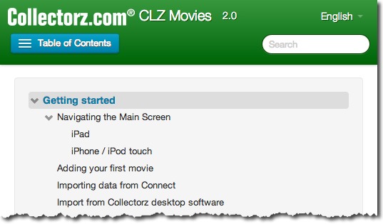
- The Table of Contents that appears after clicking the button in the top bar now also supports the expanding and collapsing of topics, just like the normal ToC that appears in the sidebar on larger screens.
- The layout of the top bar has been improved (the navigation bar that contains the company logo and name, manual name, language selector, search bar and ToC button).
An example top bar of the live manual by one of our clients: